


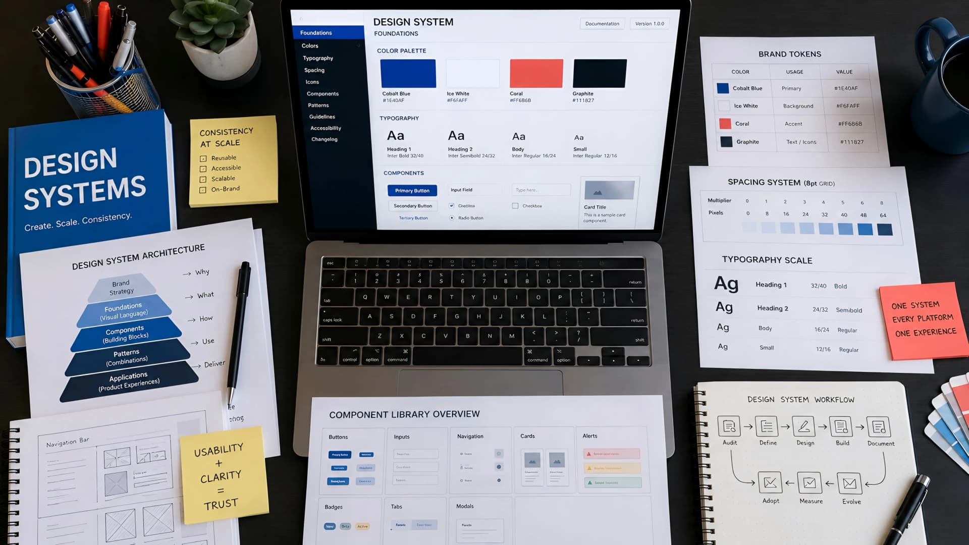
In the fast-paced world of AI SaaS and micro-SaaS, a fragmented user experience can quickly erode trust and hinder growth. Imagine a customer interacting with your web application, then your marketing site, and then your admin dashboard, only to encounter three different visual languages.
This inconsistency isn't just an aesthetic problem; it's a significant engineering and business challenge that slows down development, inflates costs, and confuses users. This is precisely the pain point a well-implemented design system aims to solve.
What is a Design System, and Why Does it Matter for Scalability?
A design system is far more than a style guide or a component library; it's a comprehensive set of standards, principles, and reusable components that guide the design and development of digital products. It acts as a single source of truth for an organization's UI/UX, ensuring uniformity across all touchpoints.
For growing AI SaaS and micro-SaaS platforms, scalability in UI/UX means maintaining consistency and efficiency as new features, products, and team members are added. Without a design system, every new UI element or feature risks diverging from the established brand, creating technical debt and a disjointed user journey.
The Core Components of a Robust Design System
At Muhyo Tech, we typically structure design systems around several critical elements. These foundations ensure both design flexibility and engineering rigidity where it counts.
- Design Principles: The fundamental values that guide all design decisions, reflecting the brand's identity and user needs.
- Visual Style Guide: Defines typography, color palettes, iconography, spacing, and imagery. This is the aesthetic bedrock.
- Component Library: A collection of pre-built, reusable UI components (buttons, forms, navigation, cards) with clear documentation for their use and behavior.
- Pattern Library: Guidelines for common user interface patterns and flows, such as onboarding sequences, data display, or form submissions.
- Content Guidelines: Rules for tone of voice, terminology, and messaging to ensure consistent communication.
- Accessibility Standards: Built-in guidelines and checks to ensure all components and patterns meet WCAG (Web Content Accessibility Guidelines) requirements.
The Business Pain: Inconsistent UI, Slow Handoffs, and Repetitive Work
Many founders and CTOs experience the symptoms of a missing design system long before they identify the root cause. Projects take longer than expected, designers and developers constantly clarify details, and new features feel slightly 'off' compared to existing ones.
This fragmented approach leads to significant business pain. Development teams spend valuable time rebuilding components or styling elements from scratch. Design teams struggle to maintain visual cohesion across an expanding product suite, leading to a diluted brand image.
Ultimately, these inefficiencies translate into slower time-to-market for new features, increased operational costs, and a frustrating user experience that fails to convert or retain customers effectively. It's a silent drain on resources and brand equity.
Engineering Response: Developing a Comprehensive Design System
Our approach to building a design system at Muhyo Tech is deeply rooted in practical engineering and user-centric design. We don't just create pretty components; we engineer a system that accelerates workflows and enhances reliability.
The process begins with an audit of existing UI/UX elements, identifying common patterns and inconsistencies. This diagnostic phase is crucial for understanding the current state and defining the scope of the system.
Phase 1: Foundation and Strategy
- Discovery & Audit: We analyze existing products, conduct stakeholder interviews, and identify pain points for both design and development teams. This includes a technical audit of current front-end codebases.
- Defining Principles: Collaborating with leadership to establish core design principles that align with business goals and brand identity. These principles guide all subsequent decisions.
- Technology Stack Selection: Choosing the right tools for the component library (e.g., React, Vue, Svelte) and documentation (e.g., Storybook, Zeroheight, internal portals).
Phase 2: Component & Style Guide Development
- Atomic Design Methodology: We often leverage Atomic Design principles, starting with foundational elements (atoms like colors, typography) and building up to molecules (buttons, input fields), organisms (forms, navigation bars), templates, and pages.
- Component Library Creation: Developing robust, accessible, and well-tested UI components. Each component is built with reusability and flexibility in mind, often using modern frameworks and libraries.
- Style Guide Documentation: Detailing every aspect of the visual language – color usage, font pairings, spacing rules, and iconography. Clear examples and usage guidelines are paramount.
Phase 3: Integration and Governance
- Documentation & Guidelines: Creating comprehensive documentation for every component and pattern, including code examples, design specifications, accessibility considerations, and use cases.
- Implementation Strategy: Planning the gradual integration of the design system into existing and new projects. This often involves migration strategies for legacy codebases.
- Governance & Maintenance: Establishing a clear process for evolving the design system, handling new component requests, updates, and deprecations. A dedicated team or individuals are often responsible for its ongoing health.
Tradeoffs and Challenges in Design System Adoption
While the benefits are substantial, implementing a design system is not without its challenges and tradeoffs. It requires a significant upfront investment in time and resources, which can be a tough sell for lean startups.
There's also the risk of over-engineering, creating a system so rigid that it stifles innovation or becomes too complex to maintain. Striking the right balance between flexibility and consistency is key.
| Challenge | Tradeoff / Consideration | Muhyo Tech Approach |
|---|---|---|
| Initial Investment | Significant upfront time and resource allocation. | Start lean, prioritize core components, iterate. Focus on highest-impact areas first. |
| Team Buy-in | Requires cultural shift for designers and developers. | Involve key stakeholders early, demonstrate immediate value, provide training. |
| Maintenance Overhead | Ongoing effort to update, expand, and govern the system. | Establish clear governance, assign ownership, automate testing and deployment. |
| Rigidity vs. Flexibility | Too strict can stifle creativity, too loose loses consistency. | Design for extensibility, allow for 'escape hatches' or specific overrides with clear rationale. |
| Migration of Legacy Code | Integrating into existing projects can be complex and time-consuming. | Adopt a phased migration strategy; integrate new features with the system first. |
The Business Outcome: Faster Launches, Stronger Reliability, Better UX
The strategic investment in a design system yields tangible business value that extends far beyond aesthetics. It fundamentally changes how product teams operate, leading to more efficient and impactful outcomes.
For AI SaaS and micro-SaaS companies, where rapid iteration and a polished user experience are critical for market differentiation, these benefits are particularly pronounced. It's about building a robust foundation for sustainable growth.
Key Business Advantages
- Reduced Design and Development Time: Reusable components mean less time spent on repetitive tasks, freeing up teams to focus on complex problem-solving and innovation. This translates to faster feature delivery and product launches.
- Improved Product Quality and Consistency: A unified UI/UX ensures a seamless and intuitive experience across all user touchpoints. This builds user trust and reinforces brand identity.
- Enhanced Brand Recognition: Consistent visual language across products and marketing materials strengthens brand recall and professional perception.
- Easier Onboarding for New Team Members: New designers and developers can quickly get up to speed by referencing clear documentation and a pre-built component library, reducing ramp-up time and increasing productivity.
- Lower Maintenance Risk: Centralized component management means bug fixes or updates applied to a component propagate across all instances, reducing the risk of inconsistencies and unexpected issues.
- Better Accessibility: Building accessibility into the system from the start ensures compliance and a wider user base, reducing the risk of legal challenges and improving inclusivity.
Integrating Design Systems into Your Engineering Workflow
A design system's true power emerges when it's deeply integrated into the engineering workflow, not just treated as a separate design artifact. This means treating components as first-class citizens in both design and code.
At Muhyo Tech, we emphasize a collaborative workflow where designers and developers contribute to and maintain the system. This 'design ops' approach ensures that components are both visually sound and technically robust.
Practical Integration Steps
- Version Control: Treat the design system's code and documentation like any other critical codebase, using Git for version control.
- Automated Testing: Implement unit, integration, and visual regression tests for all components to ensure stability and prevent unintended changes.
- Dedicated Documentation Site: Host a publicly or internally accessible documentation site (e.g., Storybook) where all components, guidelines, and code snippets are easily discoverable.
- CI/CD for Design System: Automate the build, test, and deployment of the design system itself, ensuring that updates are consistently rolled out.
- Feedback Loops: Establish clear channels for designers and developers to provide feedback, suggest improvements, and report issues with the system.
Architectural Checklist for a Scalable Design System
When approaching a design system, especially for an AI SaaS platform with evolving needs, a structured architectural checklist helps ensure nothing is overlooked. This is how we approach the foundational planning.
- Component Granularity: Are components designed to be truly reusable and composable, following principles like single responsibility?
- Accessibility by Default: Is every component built with WCAG compliance in mind, including keyboard navigation, ARIA attributes, and color contrast?
- Theming Support: Does the system support light/dark modes or custom branding themes, crucial for white-labeling or user preferences?
- Performance Considerations: Are components optimized for load time and rendering performance, avoiding unnecessary re-renders or heavy assets?
- Internationalization (i18n) Readiness: Is the component structure flexible enough to accommodate different languages, text directions (RTL), and cultural nuances?
- Testing Strategy: What level of testing (unit, integration, visual regression) is in place for each component and the system as a whole?
- Developer Experience (DX): Is the system easy for developers to use, with clear APIs, helpful documentation, and straightforward integration?
- Design Tool Integration: Are design assets (e.g., Figma components) linked and synchronized with the code components?
- Governance Model: Who owns the design system, and what's the process for updates, additions, and deprecations?
The Future: Evolving Your Design System with AI
As AI continues to shape product development, design systems will also evolve. We're seeing early applications where AI can assist in generating component variations, checking for accessibility issues, or even predicting design patterns based on user data.
The core principles of consistency and efficiency will remain, but the tools and processes for maintaining and extending design systems will become increasingly intelligent. Integrating AI-powered insights into usage patterns can help prioritize which components to refine or develop next.
At Muhyo Tech, we look for opportunities to integrate AI-assisted workflows into our design system practices. This means exploring how AI can streamline documentation, identify visual regressions, or even suggest personalized component usage based on project context, enhancing developer productivity without sacrificing human oversight.
Final Thoughts: A Strategic Asset, Not Just a Project
A design system is not a one-time project to complete and then forget. It's a living, breathing product that requires ongoing investment and care. When approached strategically, it becomes a powerful asset that drives efficiency, elevates user experience, and strengthens your brand.
For founders and CTOs of AI SaaS and micro-SaaS platforms, investing in a robust design system is investing in the long-term scalability and success of your entire product ecosystem. It transforms chaotic growth into structured, consistent expansion.
Frequently Asked Questions (FAQs)
How do design systems specifically improve UI/UX scalability for AI SaaS platforms?
For AI SaaS, design systems ensure that as you introduce new models, features, or data visualizations, the user interface remains consistent and predictable. This reduces the cognitive load for users learning new functionalities and streamlines the development of complex AI-driven components, allowing faster scaling of your product suite without UI fragmentation.
What are the key challenges in scaling a design system across multiple products or teams?
Key challenges include maintaining consistent adoption across diverse teams, managing versioning and updates without breaking existing implementations, and ensuring the system remains flexible enough to accommodate unique product requirements while retaining core consistency. Establishing a clear governance model and communication strategy is vital.
What components are essential for a scalable design system for a B2B AI platform?
Beyond standard UI components, B2B AI platforms often need specialized components for data visualization (charts, graphs), complex forms with validation, customizable tables, advanced filtering mechanisms, and robust notification systems. Components for displaying AI confidence scores, model outputs, and user feedback loops are also critical, all built with accessibility in mind.
How does a design system impact development efficiency and consistency in the long run?
In the long run, a design system dramatically boosts efficiency by providing ready-to-use, tested components, eliminating repetitive coding and design tasks. Consistency is ensured by a single source of truth for UI elements and behaviors, reducing 'design drift' and technical debt. This allows developers to focus on core business logic rather than UI minutiae, accelerating feature delivery and improving product stability.